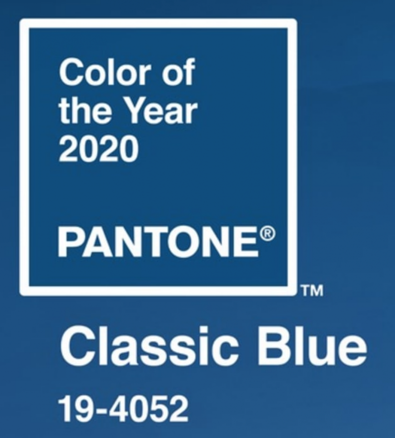
Pantone has announced the 2020 color of the year. The Voyager asked Mrs. Bowne to ask the fashion students what they thought of the selection. Here are their reactions:
I think it’s a pretty blue. It is definitely classic so the name fits. It’s pretty but I’m biased because my favorite color is a lighter shade of blue.
I’m not surprised with this coloring choice. Recently, high fashion has seen an increase in classic blue, and it is a perfect color for the classic winter season we are entering into.
It’s pretty but seems kind of boring compared to other colors.
I love the color that was chosen; I feel it is classical but not boring.
I think it is cute that you can use for a lot of things.
Blue is my favorite color. I love this kind of shade of blue. This color could be used in any season
I personally love this color; it reminds me of the night sky in the winter.
I’m not going to lie it’s pretty basic color to start a new decade with.
It’s pretty.
I am not favorable or unfavorable of this color; however, it is timeless so of course it can apply to this year’s fashion. I anticipated the color of the year to be a mustard yellow or a magenta.
I believe the color is an appropriate representation of the sad, troubling, and overall divisive events of 2019, such as the many school shootings and mass murders that have occurred throughout the year thus far. More include political, societal, and economical debates over issues, such as President Trump, that have only divided America even more. Conclusively, the color Classic Blue is a delineation of what we can call 2019 a classic tragedy/ sad story.
I like the color of the year because it is neutral and can be worn to many different occasions.
I am very pleased with the color of the year this year. I think that fits in with every season too, which I like a lot. I incorporated this color into my own line this year, which I think is really cool. I feel like it will definitely be trending in teen clothing this year.
I really like it; it’s a very practical, calming color.
I think it is a pretty shade of blue.
You can never go wrong with choosing a classic blue color. Blue is a timeless color that you cannot go wrong with choosing.
Not surpised.
My favorite color is blue so I like it and it also goes with anything
I don’t personally wear that color a lot, but I can see multiple people wearing it often in the coming year. I’m actually making something using a similar color right now.
I think this choice was a little basic considering this year was filled with crazy colors like chartreuse or anything neon or vibrant, and I don’t think blue was as prevalent in 2019 as previous colors of the year.
I really like this color. I just wasn’t expecting a color like this to be the color of the year. I was expecting a more upbeat and unique color.
I think that this color is pretty, and I am using colors similar to it in my line. My theme is Umama Fall in Hawaii and I think this color would be good to use to resemble the water.
I think the color is interesting yet unique.
It’s a very basic and gloomy color; I don’t really like it to be honest
I like all shades of blue so I like it.
It’s cute.
This is a very pretty color. I like it a lot. I believe it shouldn’t be the color of the year. Yellow had a more impact as I’ve seen it grow into a popular
Classic blue is a very nice basic color for this year.
It is muted. In between purple and blue.
It looks more of cobalt than a classic blue, its very exciting and a very bold color choice. In comparison to the recent year being purple which is the similar color family I am a little underwhelmed.
I didn’t expect this to be the color of the year. I don’t like it.